Though not particularly useful for my current research, (a genetic algorithm that learns keyword and keyword phrase relevancy to information requests over time), I felt that this was just too useful to forget about as I powered ahead..
sparklines
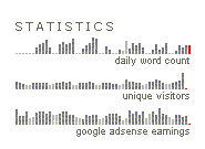
sparklines are tiny, word-like diagrams or graphs of data that are so small as to be meaningfully used as a sentence within a paragraph of text.
I didn't get it at first either, but what caught my eye was a small section of bar graphs representing the current google adsense activity:

This is powerful in that it conveys a lot of information about data in a small space and can also be realtime and dynamic. I could see diagrams of this sort as cells in a spreadsheet or as simply another column of data in a report.
Here is another Data Visualization technique that, frankly, I don't really get at the moment. instinct tells me I should make a note of it as well in light of the above-mentioned:
elastic lists
elastic lists enhance "facet browsing" as proposed by The Flamenco Search Interface Project that visualize the relative proportions (weights) of metadata values by size and that visualize the "unusualness" of a metadata weight by brightness as a user "drills down" though a large dataset, mining for answers or creating ad-hoc metadata report filters
Here is an interesting interactive demonstration of Elastic Lists
-shannon norrell
No comments:
Post a Comment